Pioneer Business Club
Project Overview
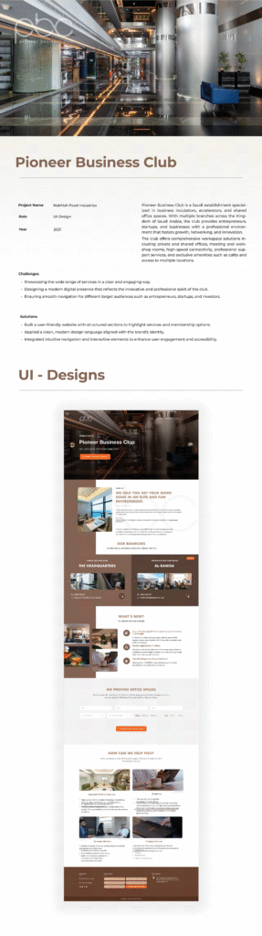
Pioneer Business Club is a premium business hub designed to support entrepreneurs, startups, SMEs, and investors through modern office spaces, business acceleration programs, networking opportunities, and professional services. The goal of the project was to redesign the digital experience to clearly communicate the club’s value while making it easier for visitors to explore services, locations, and membership options.

Project Type
Corporate Website Design
Industry
Business Services / Coworking Spaces
Role
UI Designer
Duration
2 Weeks
Budget
Confidential
Problem
The existing website lacked a clear content hierarchy, making it difficult for users to understand the club’s services, locations, and membership offerings. The interface did not effectively communicate the premium nature of the brand, and navigation was not optimized for entrepreneurs, startups, and business professionals seeking relevant information quickly.
Scope of Work
Objectives The redesign focused on several business goals: * Improve overall user experience. * Increase engagement with business services. * Encourage membership inquiries. * Showcase branch locations clearly. * Strengthen brand perception. * Simplify navigation.
- Research Before starting the interface design, I analyzed: * Existing website structure. * Competitor business clubs. * Shared workspace platforms. * Corporate service websites. * User navigation patterns. * Information architecture.
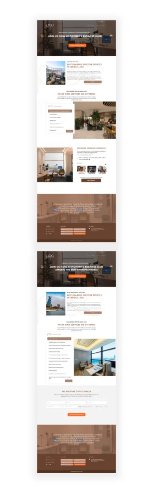
- Design Strategy The interface was built around three design principles: Clear Information Hierarchy Organize content into logical sections that guide users naturally. Premium Visual Experience Use elegant typography, generous whitespace, and high-quality imagery to reinforce trust. Conversion-Oriented Layout Position calls-to-action strategically throughout the website to encourage inquiries and membership registration.
- Visual Design The visual language emphasizes professionalism and warmth through: * Neutral color palette. * Brown accent colors inspired by the brand. * Large photography. * Clean typography. * Spacious layouts. * Consistent spacing system. * Card-based content presentation.
- UX Decisions Several usability improvements were introduced: * Simplified navigation menu. * Clear service categorization. * Dedicated branch showcase. * Interactive service cards. * Consistent CTA placement. * Improved footer navigation. * Better content grouping. * Mobile-first responsive layout.
Solution
Designed a clean, modern, and responsive interface with a structured information architecture that highlights services, branch locations, and membership options. Implemented intuitive navigation, strong visual hierarchy, reusable UI components, and strategically placed calls-to-action to improve usability, reinforce the brand identity, and provide a seamless user experience across all devices.